Page 1 of 1

I tried doing some fanart

Posted: Fri Jan 28, 2005 12:55 pm
by Niwashi2
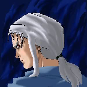
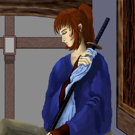
I just started trying drawing oekaki a couple of days ago. Since my first two pictures with it are Juuni Kokki related, I thought I'd share them here. Hankyo was my first attempt at drawing on the computer and Sekki my second, but I think for a beginner, they didn't come out too bad. (Both were drawn looking at reference pictures from the show - I'm not up to doing this purely from my own imagination yet.)

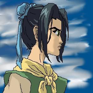
I think I got Sekki's profile too flat and his eye a little too big. Plus I stopped on that one when I ran out of time to work on it - otherwise I might have cleaned up the shading and highlighting a bit more. Hankyo I'm pretty happy with except that I messed up a little on the scowl wrinkles accross the bridge of his nose between his eyes.

Image Image
click thumbnail for a (slightly) larger image

Niwashi

Posted: Tue Feb 08, 2005 2:29 pm
by Luingaladhien
Whoa! I'm impressed. :shock:

The pictures are not "too bad"... they are GREAT for a beginner. :D
I'm sure your fan art would reach professional standard if you practise more. So keep up the good work.

By the way, what programme did you used??


<Luingalahien>

Posted: Tue Feb 08, 2005 4:38 pm
by Niwashi2
Thanks :D :D I'm glad someone likes them. I may have my doubts about ever reaching "professional standard", but I do plan to practice more, cause I'm having a lot of fun with this. And hopefully, the pictures will impove in the process.

I did them online at OekakiCentral.com using their OekakiBBS applet.

I've done a couple more pictures since then, trying out a more realistic style than the anime-style flat line work of the first two (though I'm still doing them of anime characters). I can't decide which style I like best, but realistic shading definitely takes a lot longer.

One of the new pictures is again from Juuni Kokki. I'm pretty happy with how Gyousou's face came out, but his hair was hard. I was intending to leave the linework out of the finished pic entirely, but ended up leaving some of it outlining his hair because otherwise it just didn't have enough definition. (His bangs tended to get kind of lost against his forehead.) I think I got all the proportions right, though. And I like his expression.

Image

The other one is a Rurouni Kenshin fanart, but I'll post it here as well. The background came out terrible. I'm pretty happy with Kenshin himself, though, in spite of a few minor glitches in proportions (like his posture isn't quite what I wanted and his sword is too narrow with a short hilt). Still, it's my most ambitious picture yet. (Well, it's more than a headshot, anyway.)

Image

(These are again thumbnail versions. Click on them for the full-sized images.)

Niwashi

Posted: Wed Feb 09, 2005 6:43 am
by yuna-ling
I like your Hankyo best :)

I think u did a good job =), they all looked pretty realistic. :D

Posted: Wed Feb 09, 2005 9:55 am
by Niwashi2
yuna-ling wrote:I like your Hankyo best :)

I think u did a good job =), they all looked pretty realistic. :D
Thanks. I think overall I like the Hankyo one the best too, though there are elements of each of the others I'm happy with, like Sekki's hair, Gyousou's face, and in the Kenshin pic both his face and his hand holding Tomoe's scarf. But the later pictures also have more problem areas detracting from the parts I like. I guess it's because I've been moving to more complex pictures faster than I can improve. I think Hankyo came out the best because it was the easiest. :wink:

Well, that just means I need more practice so I can do complex pictures as well as easy ones. I think maybe I'll try Rokuta next. :)

Niwashi

Posted: Sat Feb 12, 2005 1:34 am
by carlanox
I really like the ahnkyou drawing...Looks very real to me :D. wish to see another of your drawing hehe